On a crisp October evening in 1999, the crowd at Hamilton's football game buzzed with an unusual anticipation. It wasn't just the thrill of the game that had the community on edge—something even bigger was about to happen. At halftime, a new logo, one destined to become the symbol of Hamilton for generations, was set to be unveiled. This moment, however, was the result of a journey that began months earlier, sparked by an unexpected challenge that would bring out the creativity and unity of the entire school district.
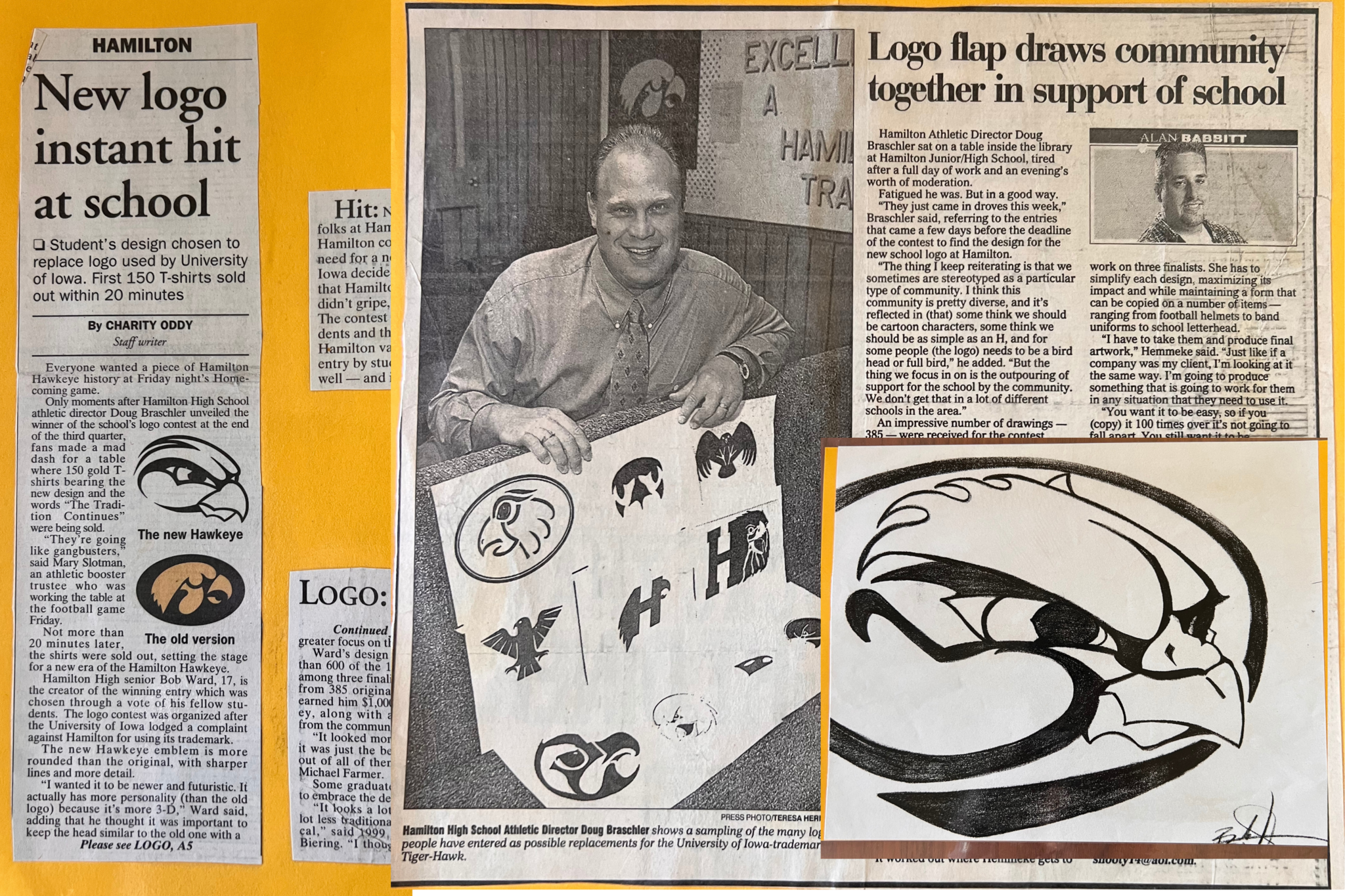
That summer, Athletic Director Doug Braschler and head football coach Terry Stehle faced a sudden dilemma. For more than a decade, Hamilton Community Schools had proudly displayed the University of Iowa’s Tigerhawk logo on their uniforms and throughout the district. But that year, everything changed. “We went to order the Iowa Tigerhawk, as we had for years,” Braschler recalls, “and Terry came in, threw down the supplier’s magazine, and said, ‘We’ve got a problem.’ The University of Iowa had decided they wouldn’t allow us to use their trademarked logo anymore.”
It was a significant issue. The Tigerhawk was embedded in Hamilton’s identity. It was everywhere—from the gym floor to the band uniforms. “This is going to be a problem,” Braschler thought. But rather than simply replace the logo with something generic, the school chose to turn the obstacle into an opportunity. Braschler and his team decided to hold an art contest to design a new Hawkeye logo, calling on the creativity of students, staff, and the community.
The response was overwhelming. “We figured we’d get maybe 75 to 100 entries,” Braschler reflects. “But we ended up with 385.” The entire district was engaged, with designs pouring in from students, alumni, and staff members alike. A committee made up of a wide range of boosters, PTO leaders, and students from both the middle and high schools carefully reviewed each submission. Narrowing down 385 entries was no small task, but eventually, they selected a top 10, which was then whittled down to a final three.
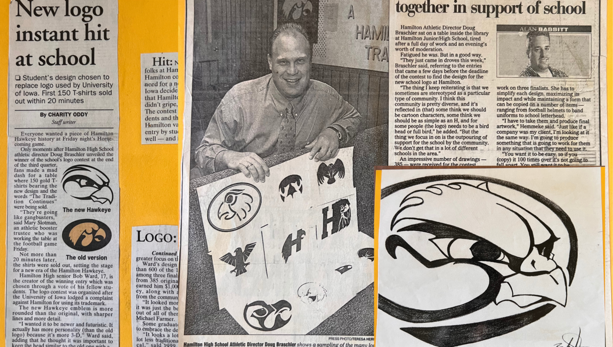
Among the finalists was a design submitted by Bob Ward, then a senior at Hamilton High School. Ward had a passion for art, and when the contest was announced, he felt an instinctive drive to participate. “It was kind of a no-brainer for me,” he recalls. “Why not try to win the thing?” His design, a bold reimagining of the Hawkeye, captured the essence of the school and quickly rose to the top of the selections.
Winning the contest turned out to be more than just a school achievement for Ward—it was the start of something much larger. “25 years goes by really fast,” Ward reflects. “It was a pretty epic moment in my life and the beginning of my career in art and design. That contest gave me the confidence to pursue this path.”
What made Ward’s design especially memorable was a hidden detail that only the most observant would catch. “It’s true,” he admits with a smile. “I put my initials in there—R-W. Once you see it, you can’t unsee it. The R is in the cheek, and the whole head is shaped like a W. It was a little personal signature, a piece of me in the logo.”
The unveiling at halftime was nothing short of electric. As the crowd gathered to witness the new symbol that would represent Hamilton, the excitement in the stadium grew. “People didn’t care about the game,” Braschler recalls. “They just wanted to see the logo.” When it was finally revealed, the community erupted with pride and enthusiasm.
Since that night, the impact of Ward’s design has endured. “Whenever I go back home, I see it everywhere,” Ward says. “It’s on barns, on signs, and all over Hamilton. It’s one of the most impactful things I’ve done in my career, and I did it right at the start.”
For Ward, the legacy extends beyond just his own pride. Now, his niece and nephew Elle and Evan Kowalski attend Hamilton, and they proudly wear the Hawkeye on their clothes, even if they don’t fully understand its significance yet. “They say, ‘Uncle Bob made that!’” Ward laughs. “They don’t really get it now because they’re young, but someday they will. Since I live in California now and they’re still in Hamilton, it’s nice to have something that connects us both to the community I grew up in.”
Hamilton’s new logo wasn’t just a fix for a trademark issue. It became a symbol of the school’s resilience and creativity. What started as a crisis turned into an opportunity to involve the community and inspire future generations. Today, the Hawkeye stands as a testament to Hamilton’s spirit—one that refuses to be defined by challenges but instead turns them into lasting legacies.


